
It’s no secret that Dissh is my all-time favourite brand. And no, it’s not just because I’d wear half their collection without hesitation.
It’s because of how their brand (and ultimately their website) makes me feel. The moment you land on it, there’s no guesswork. No noise. Just a brand that knows exactly who it is.
That’s Dissh.
And here’s the thing. They’re not loud. It’s not doing anything wildly complex. But it is doing a few key things exceptionally well that most Shopify brands still miss.
Let’s break it down properly. Not just what they’re doing, but why it works, and what you should be paying attention to if your own site isn’t quite landing the way it should.
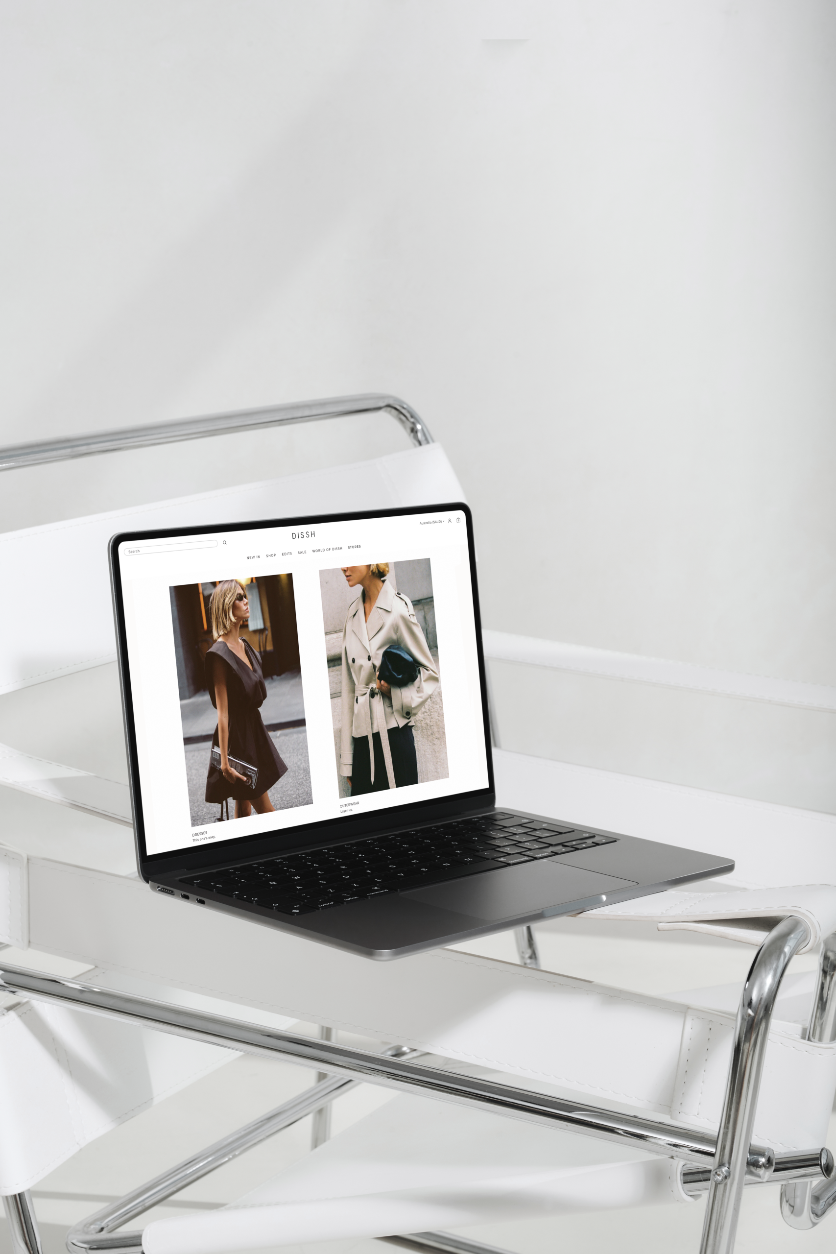
The Brand Is Felt Without The Need To Explain Itself
Dissh doesn’t introduce itself with paragraphs. It doesn’t need to. Within seconds, you understand the brand. Clean lines. Neutral palette. Confident femininity. Effortless, but considered.
That’s brand injection.
They let:
- Photography lead
- Negative space breathe
- Styling tell the story
Instead of over-explaining, they show you who they are.
What most brands do instead:
They try to “clarify” their brand through copy, a million banners, and value & trust props stacked on top of each other.
Result? Noise.
What Dissh does: They trust their aesthetic to carry meaning. And that trust builds authority.
Takeaway: If your homepage needs explaining, your brand isn’t clear yet.
The Site Is Effortless to Move Through
There’s no friction on Dissh’s website.
You’re not figuring things out. You’re not pausing to think about where to go next. It just flows.
That comes down to a few things they’ve nailed:
- Clear hierarchy. You know what matters straight away
- Familiar navigation. Nothing feels unfamiliar or forced
- Immediate access to product. No unnecessary layers between you and what you came for
It’s simple, but not basic. And that’s the difference most brands miss. They overcomplicate in the name of being “different”, when what actually converts is ease. Predictability, done well.
Dissh understands that your customer doesn’t want to learn your website. They want to shop.
Takeaway: Where are you making your customer work harder than they need to?
Product Pages That Sell the Lifestyle, Not Just the Piece
Dissh’s product pages aren’t just functional. They’re persuasive.
You’re not just buying a dress. You’re stepping into a version of yourself.
They use:
- Multiple angles (but not excessive)
- Movement-led imagery
- Styling context (how it fits into a wardrobe, not just on a model)
And importantly, they keep everything clean. No clutter. No desperate persuasion tactics. Just confidence.
Here’s the shift:
They don’t try to convince you. They let you decide you want it. That’s a very different energy.
Takeaway: Are your product pages pushing… or are they pulling?
Restraint Is Doing the Heavy Lifting
This is where most brands get it wrong. They think more = better. More badges. More text. More pop-ups. More “reasons to buy.”
Dissh does the opposite. They edit.
And that restraint is what makes everything feel:
- Considered
- Premium
- Trustworthy
Because nothing feels forced.
Important truth: Clutter doesn’t increase conversion. It kills clarity. And clarity is what converts.
Takeaway: What could you remove from your site that would actually make it stronger?
Consistency Across Every Touchpoint
This is subtle, but powerful.
Dissh’s:
- Typography
- Colour palette
- Image style
- Tone
It’s all consistent.
No jarring shifts. No “this feels like a different brand” moments. That consistency builds trust quickly. Because your brain relaxes. You’re not questioning anything. You’re just… in it.
And when trust is high, decisions are easier.
Takeaway: Does every page on your site feel like it belongs to the same brand? Or does it start to unravel after the homepage?
The Real Reason It Converts
It’s not hacks.
It’s not urgency banners.
It’s not clever copy tricks.
It’s alignment.
Brand, design, and user experience are all saying the same thing. And when that happens, conversion feels natural. Not forced.
If Your Site Isn’t Converting Like This…
Ask yourself:
- Does your brand come through instantly, or does it need explaining?
- Are you guiding your customer, or overwhelming them?
- Do your product pages create desire, or just display information?
- Where are you adding instead of refining?
Because more often than not, the issue isn’t effort. It’s direction.
Dissh isn’t doing more. They’re doing less, better. And that’s the difference.

")