
There’s a certain kind of brand that walks into the room and doesn’t ask for attention. It commands it.
Right now, that brand is wearing chrome.
Not soft neutrals. Not safe sans-serif typfaces. Chrome. Reflective, liquid, almost futuristic. The kind of aesthetic that feels like it knows something you don’t.
So the question is, is chrome just another passing trend? Or is it signalling something deeper about where branding is headed?
Let’s get into it.
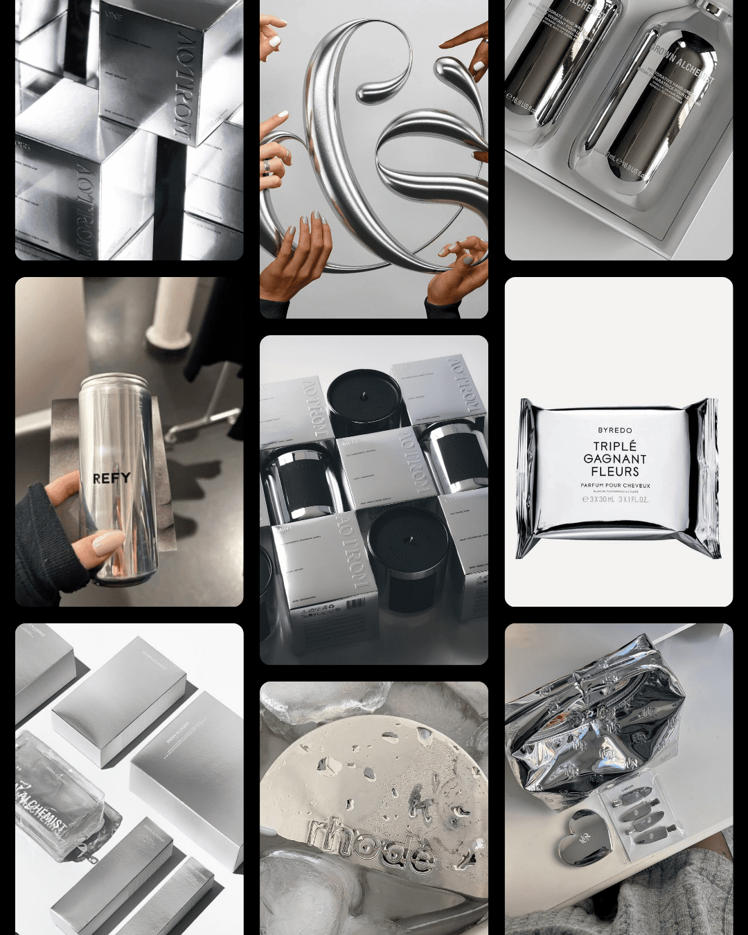
What we mean by “chrome” in branding
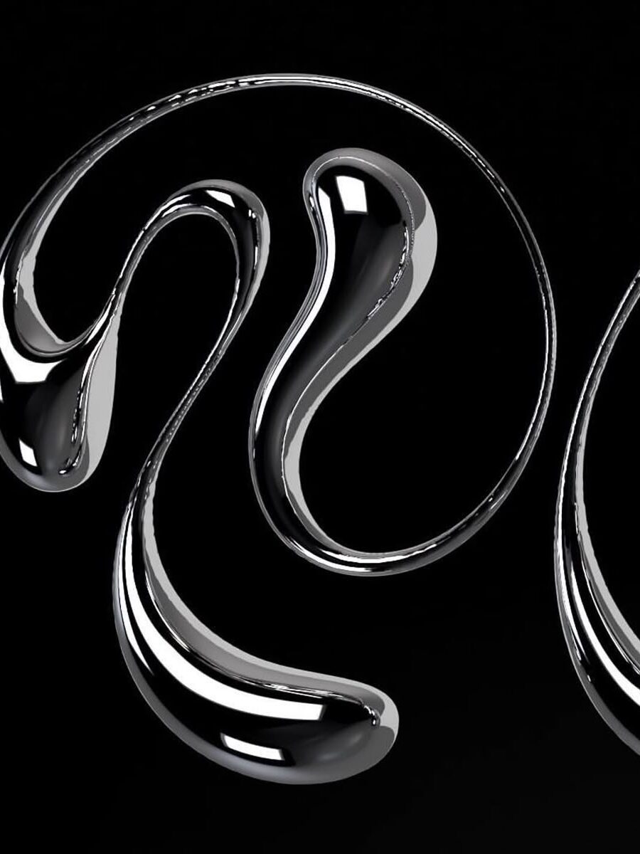
Chrome isn’t just a finish. It’s a feeling.
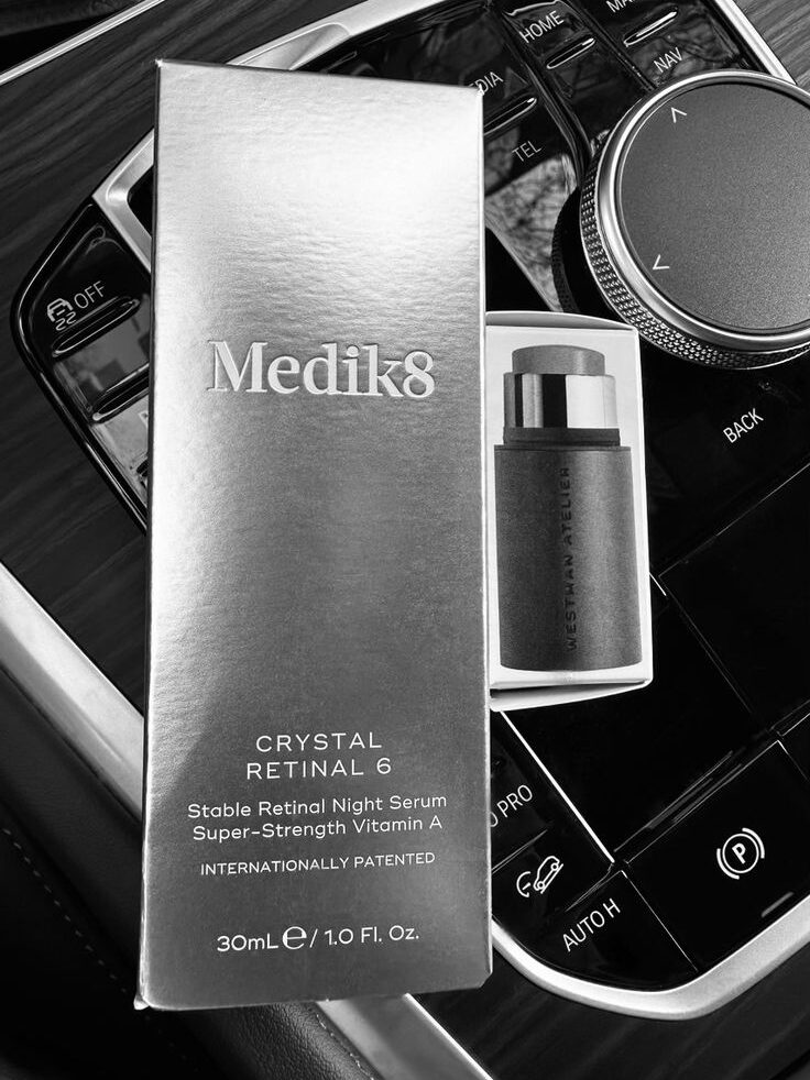
Think high-shine metallics, mirrored surfaces, liquid silver typography, hyper-gloss packaging. It pulls from Y2K nostalgia, but it’s been sharpened for now. Less kitsch, more control.
You’ll see it in:
- Product logos that look almost melted into place
- Packaging that reflects light like jewellery
- Campaign visuals that feel closer to digital art than traditional photography
It sits somewhere between tech and beauty. Clean, but not cold. Bold, but still considered.


The brands doing it well
Let’s talk about the ones who aren’t just using chrome, but owning it.
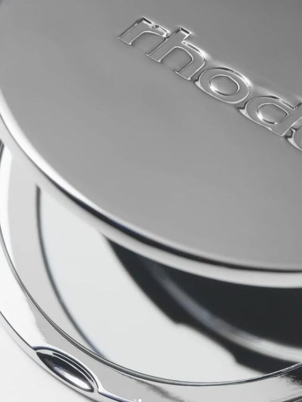
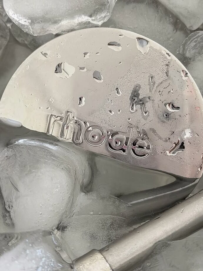
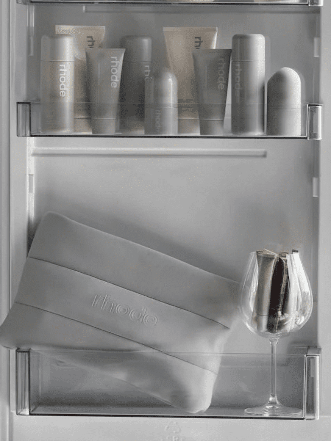
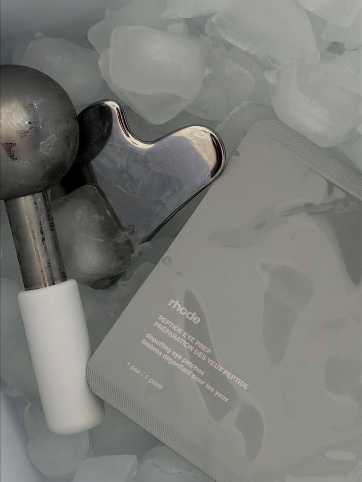
Rhode
Chrome works here because it mirrors the product itself. Glazed, dewy, reflective skin. The branding doesn’t fight the formula, it amplifies it.
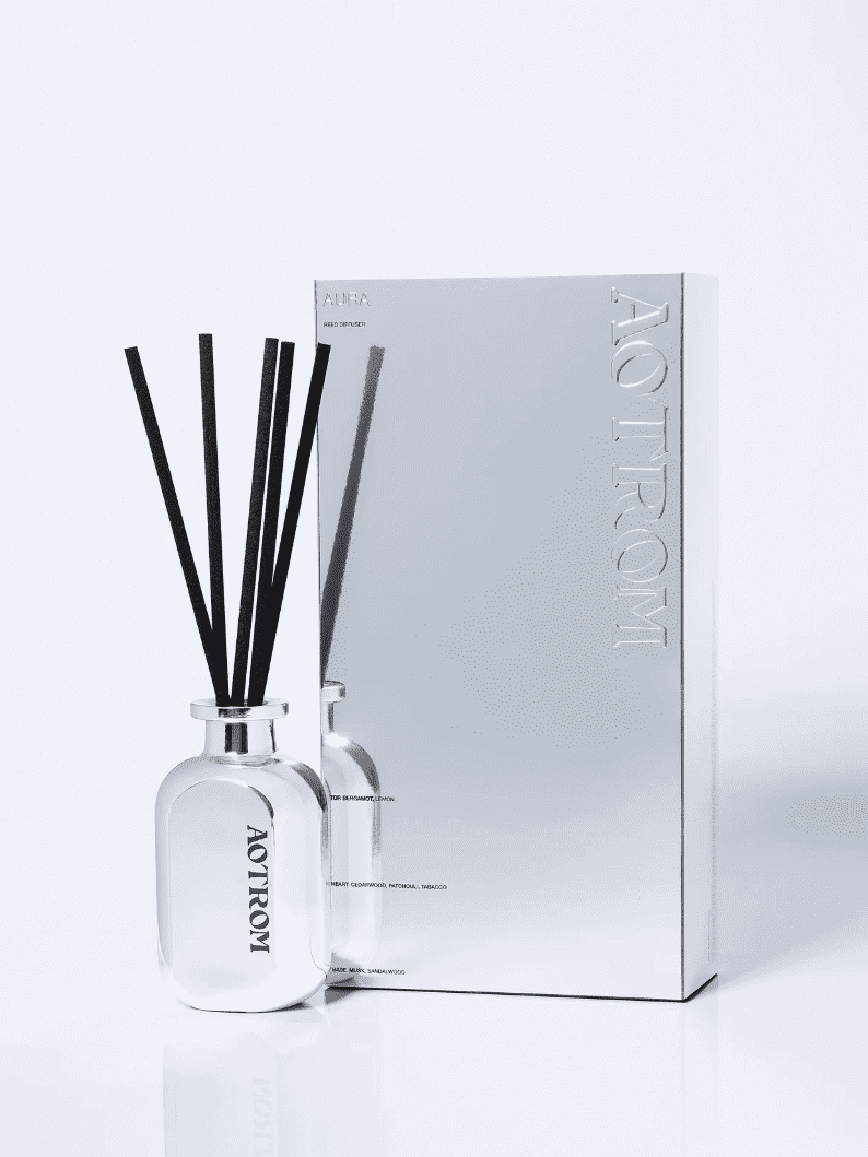
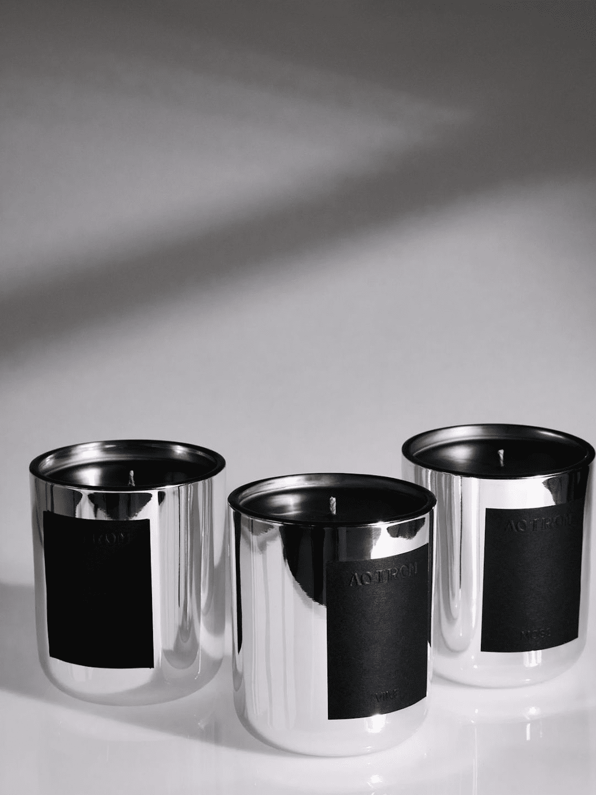
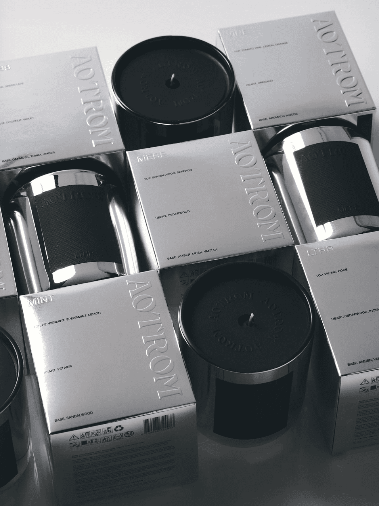
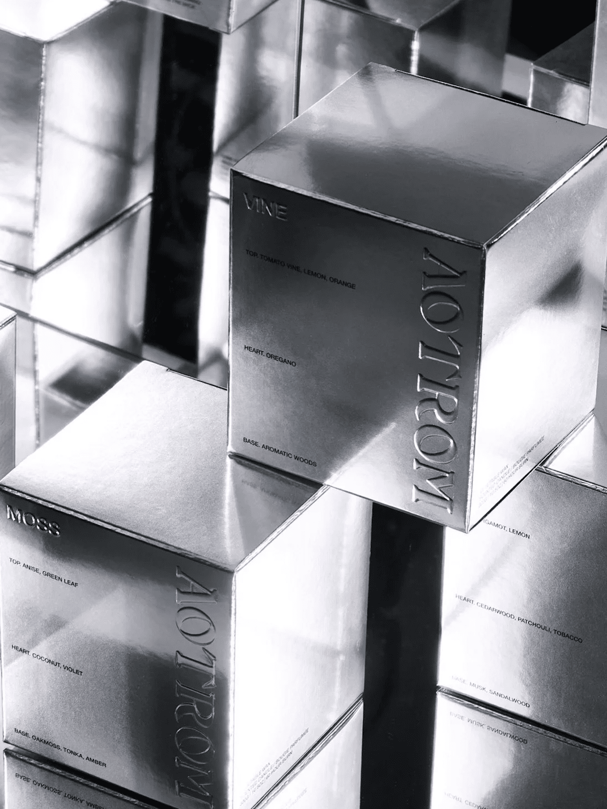
Aotrom Brand
Aotrom’s take on chrome feels quieter, but sharper. They’re not going full hyper-gloss everywhere. Instead, they use chrome as a punctuation point. A flash of silver against an otherwise restrained palette. It draws your eye exactly where they want it.
What’s interesting is the tension. There’s softness in the brand, but the chrome cuts through it. It adds edge without losing elegance. It’s controlled. Intentional. And that’s why it works.
Why chrome works right now
Let’s be honest. A lot of brands are starting to blur together. Soft beige palettes. Clean sans-serifs. Minimal everything. It looks nice. But does it stick? Chrome cuts through that.
1. It creates immediate visual impact
This is first impression territory. The “stop mid-scroll” moment. Chrome reflects light, movement, energy. It feels alive on screen, which matters when your brand lives on Shopify.
2. It signals confidence
Chrome doesn’t whisper. It doesn’t soften itself to be more palatable. When a brand uses it well, it reads as self-assured. Like it knows its worth and isn’t here to dilute it.
3. It bridges physical and digital
This is where it gets strategic. Chrome feels just as at home on packaging as it does in a 3D render or digital campaign. That consistency across touchpoints is rare, and powerful.
But here’s the part most people miss
Chrome is high risk.
Used without intention, it can feel:
- Gimmicky
- Overly trend-driven
- Completely disconnected from your product
This is where most brands get it wrong. They see the aesthetic, not the alignment.
Ask yourself:
Does this reflect the feeling of your product?
Or are you trying to borrow relevance from something that isn’t yours? Because your customer can feel the difference.
Is chrome here to stay?
Short answer? Yes. But not in the way you think.
The execution will evolve. The hyper-Y2K references might soften. The finishes might become more refined, more subtle, more integrated. But the underlying shift? That’s landing, hard.
We’re moving away from safe, overly-muted branding. Towards something with edge. Texture. Presence.
Chrome just happens to be the current expression of that.
How to use chrome without looking like everyone else
If you’re considering it, here’s how to approach it like a founder who knows what she’s doing.
Be selective
You don’t need chrome everywhere. In fact, you shouldn’t.
Use it as an accent. A highlight. A moment.
Think:
- Logo lockups
- Key packaging details
- Hero visuals on your homepage
Pair it with restraint
Chrome needs contrast.
Balance it with:
- Clean layouts
- Intentional white space
- A grounded colour palette
This is what keeps it from tipping into chaos.
Tie it back to your product
This is non-negotiable. If your product is soft, organic, slow… chrome might not be your move.
But if it’s glossy, performance-driven, high-impact? Now we’re talking.
The takeaway
Chrome isn’t just a trend. It’s a signal.
A signal that brands are ready to be seen again. To take up space. To create a first impression that actually lands. But like anything with this much presence, it demands intention.
Because when it’s done right, it doesn’t just catch the light.
It reflects who you’ve become.
And that’s the whole point.

")