
You’re not the same founder you were two years ago. Your standards are higher. Your product is sharper. Your customers expect more.
So why does your brand still look like version one of you? This is where most founders get stuck. They think they need a new logo. Maybe a new colour palette. A slight refresh. But the disconnect you’re feeling? It’s not a design problem. It’s a growth problem.
The real issue isn’t your visuals
When your brand starts to feel off, it’s usually because:
- Your positioning has shifted
- Your customer has evolved
- Your product has improved
- Your taste has refined
But your brand hasn’t caught up. So you end up with a strange mismatch.
A strong business… wrapped in an outdated identity. And no amount of logo tweaking fixes that.
The signs you’ve outgrown your brand
You’ll feel it before you can articulate it.
- You hesitate to send people to your site
- Your visuals don’t match the quality of your product
- You look at competitors and feel slightly… behind
- Your brand doesn’t reflect your current price point
It’s subtle. But it chips away at your confidence. And your customer can feel that.
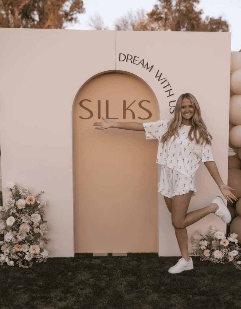
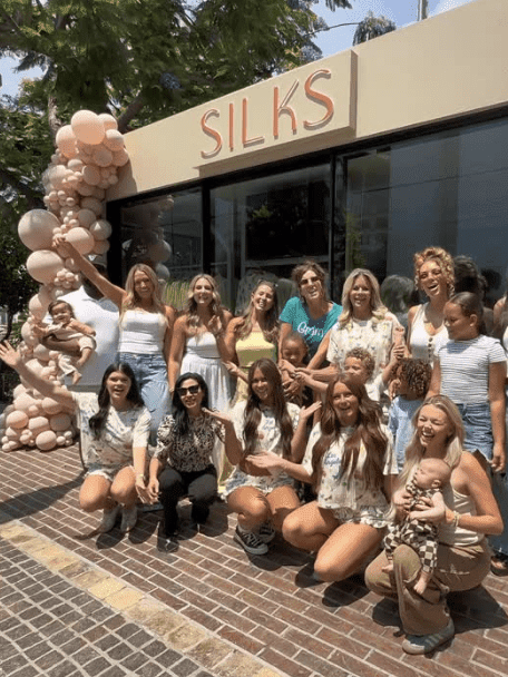
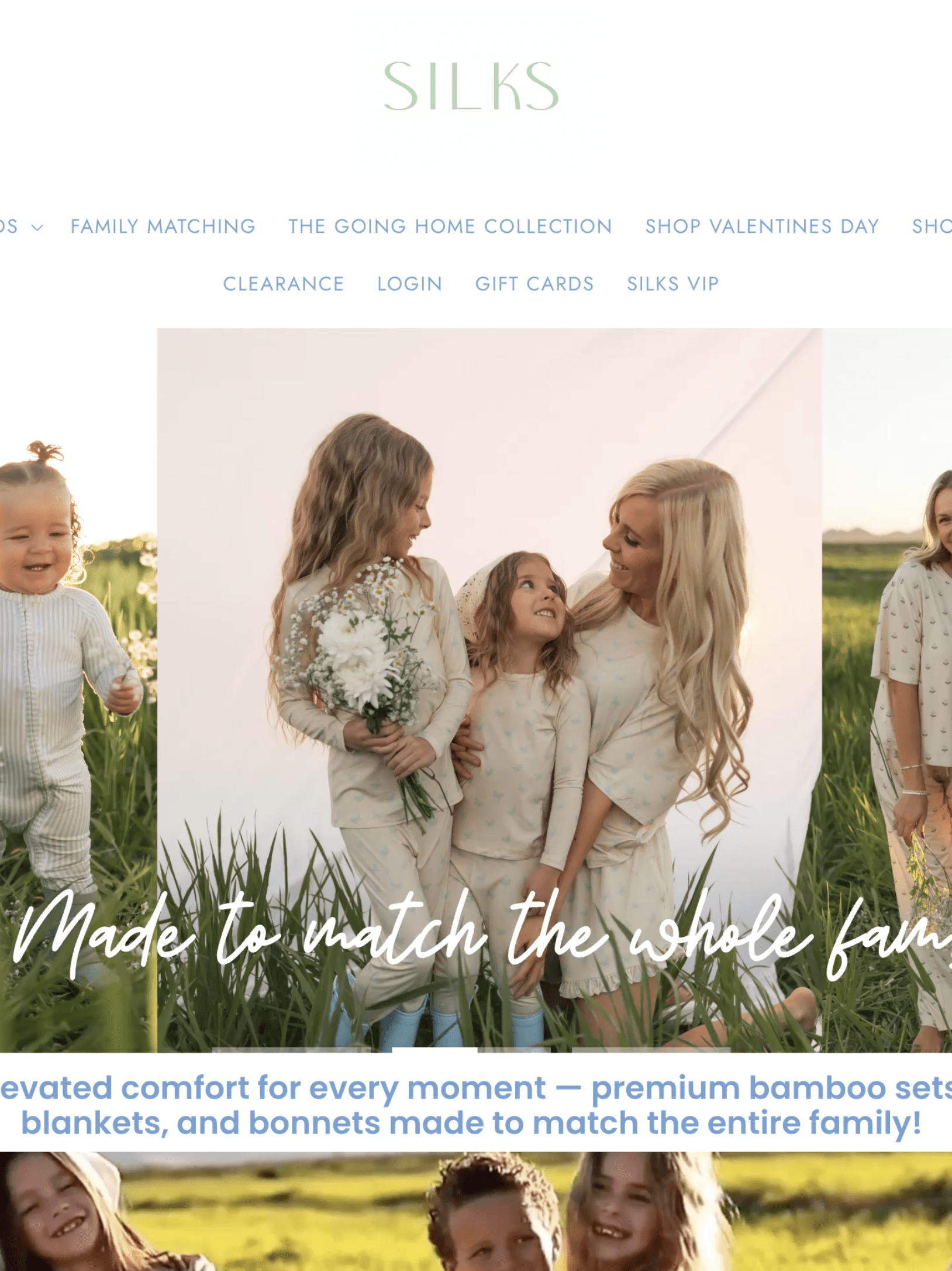
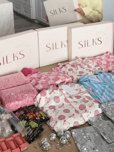
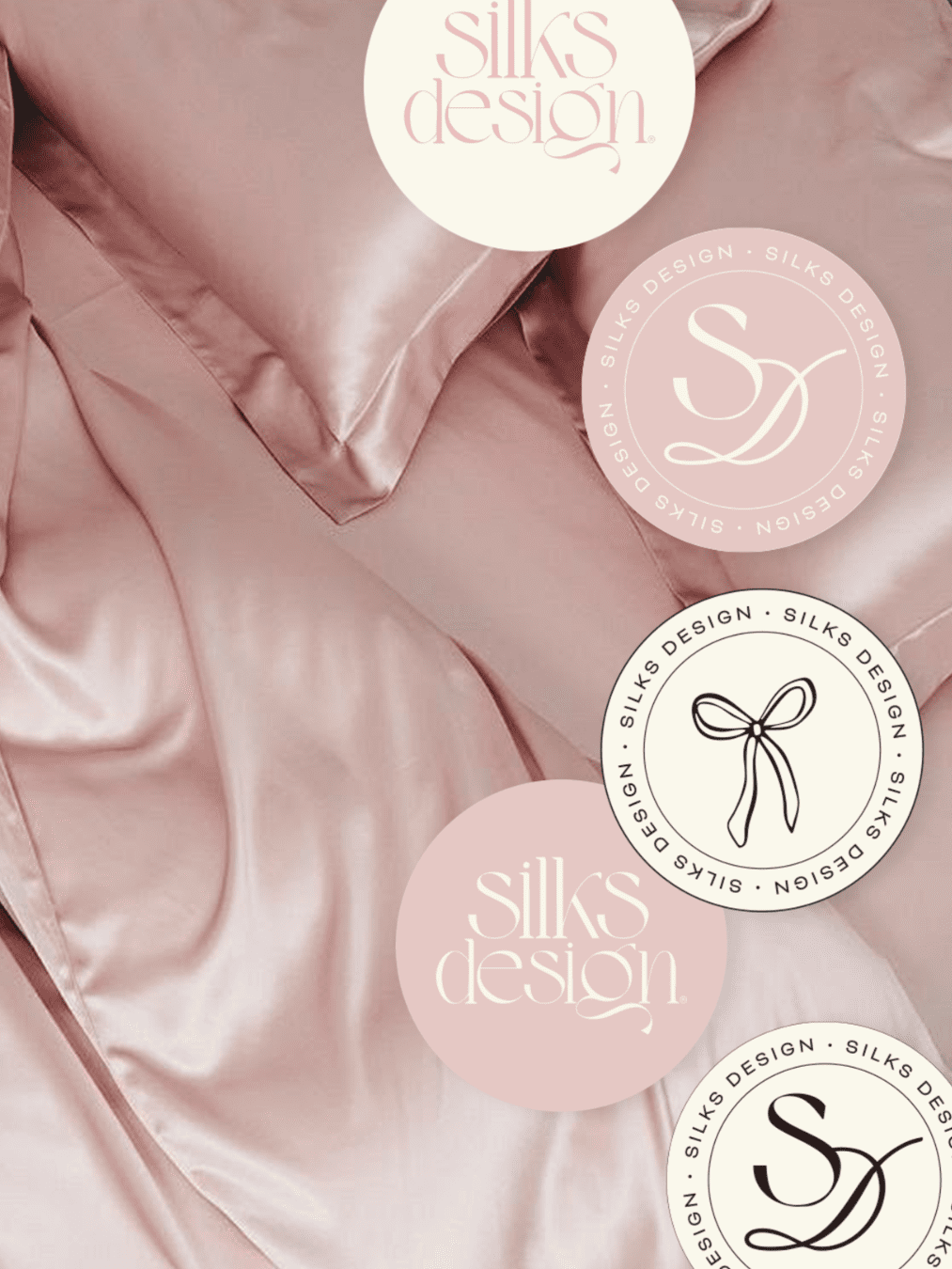
Case Study: Silks Design
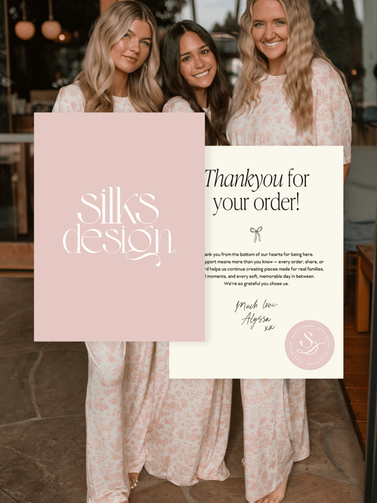
This is where Silks Design became a brand, not just a logo. We didn’t just redesign a logo and call it a day. We built out a full suite of brandmarks. Different lockups, submarks, and variations that could flex across packaging, social, web, and in-store without ever losing recognition.
Before
After
If you put the before and after side by side, the difference is immediate.
Before, the Silks Design brand leaned very light. A single peach-toned wordmark, minimal styling, and not much else to support it. It was pretty. But it relied on that one logo to do all the work. After, everything feels layered. Intentional. Fully built out.
A brandmark system, not a single logo
Instead of one logo stretched across every touchpoint, we introduced multiple lockups and submarks. You can see it in the circular stamps, the scalloped edges, the bow detail. Each one has a role.
- The curved lockup softens the brand and adds movement
- The scalloped badge gives structure and presence on packaging
- The bow submark brings in personality and a recognisable signature
Now, whether it’s a swing tag, a thank you card, or a website detail, the brand shows up appropriately. Not repetitively.
Typography with contrast and character
The original type felt clean, but safe. We refined this into something more expressive.
A serif with contrast. Softer curves paired with sharper moments.
You can see it clearly in the updated “Silks Design” lockup. The letterforms feel more intentional. There’s rhythm to it. It holds attention longer. Which is exactly what you want.
A colour palette that actually works with the product
This is where the shift really lands. Before, the peach tone felt flat and slightly disconnected from the product imagery.
After, the palette moves into soft blush, warm rose, and creamy neutrals. Nothing harsh. Nothing competing. When placed over product photography or packaging, it complements instead of clashing. It lets the product lead, while still creating a distinct brand world. Even the striped variation introduces dimension without overwhelming. It adds depth, but stays calm.
Styling that carries through every touchpoint
The biggest difference isn’t one element. It’s how everything now works together.
- The embossed packaging adds a tactile layer
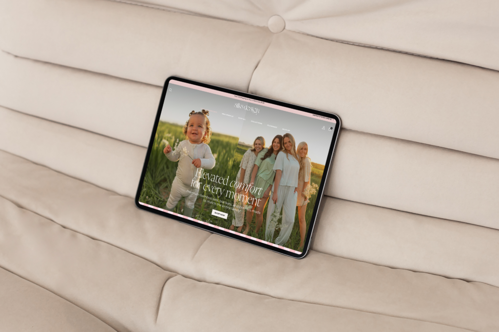
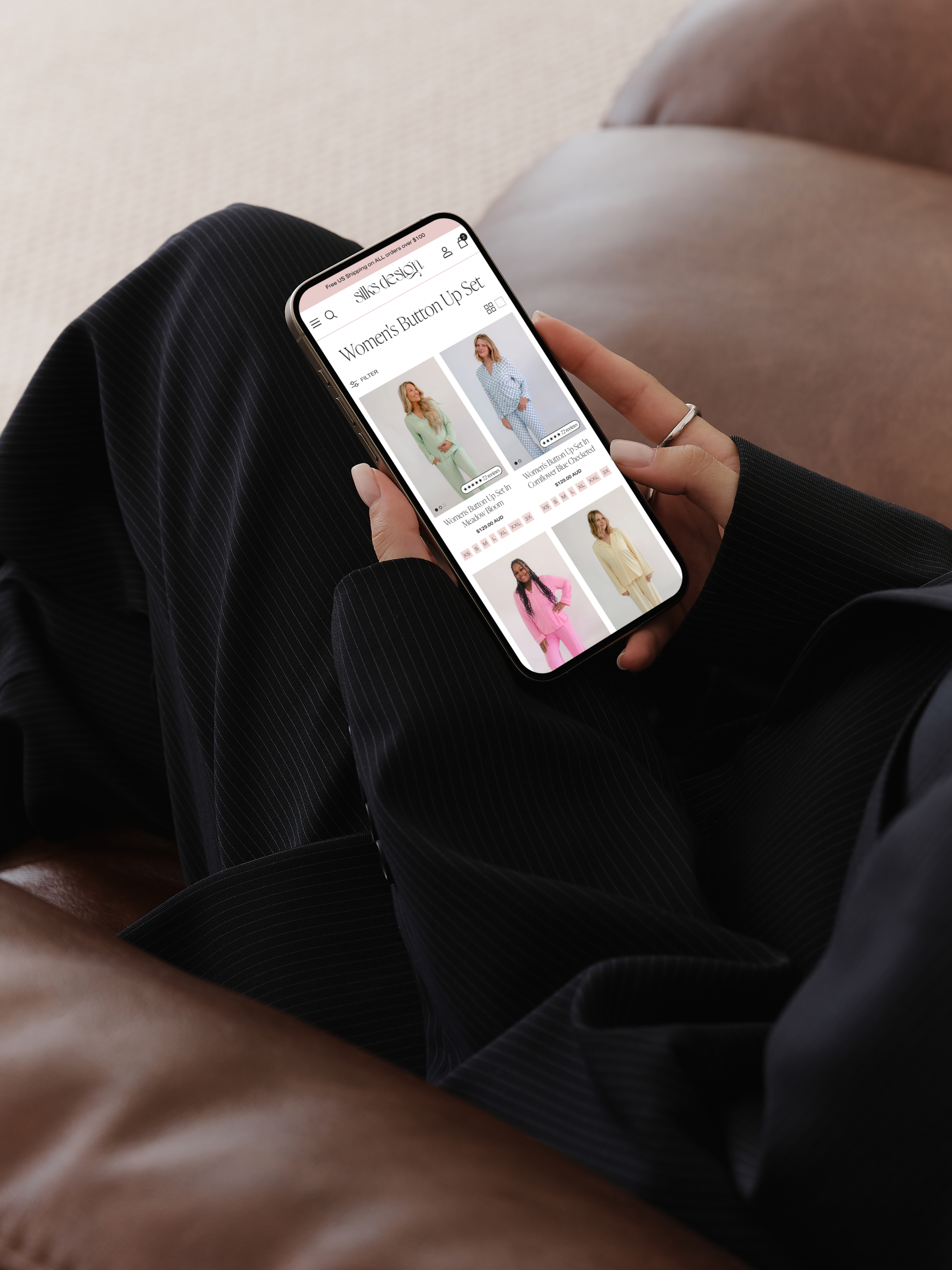
- The Shopify site mirrors the softness and spacing of the brand
- The typography, colour, and shapes repeat in subtle ways across every asset
Before, each touchpoint felt separate. Now, it feels cohesive. Like one clear identity moving through different formats.
The shift
Silks Design went from:
A soft, simple brand with limited range
To:
A fully realised identity with depth, flexibility, and presence. And that’s the difference your customer feels straight away. Not louder. Just more considered.
Why a “quick refresh” won’t cut it
Here’s the part most people won’t say. A surface-level rebrand often makes things worse. Because you’re redesigning something that was never clearly defined to begin with.
You don’t need a prettier logo.
You need clarity.
What actually needs to change first
Before any design happens, you need to get honest about:
- Positioning
Where do you sit now? And where are you trying to go? - Perception
How do you want to be seen? Not vaguely. Specifically. - Point of difference
Why you, over anyone else in your space? - Visual direction
Not trends. Taste. Restraint. Intentional choices.
This is the groundwork. This is what makes a rebrand land.
The shift
A strong brand doesn’t just “look better.”
It feels aligned. Like you’ve finally caught up to yourself.
And when that happens?
You stop second-guessing how you show up.
Your customer feels it instantly.
And everything clicks into place a little faster.
If your brand feels like a past version of you, that’s not a failure.
It’s a sign you’ve grown. Now it’s time your brand did the same.

")