
You’ve just wrapped your rebrand. New logo. New palette. Everything feels fresh, considered… aligned with who you’ve become.
You upload it to your Shopify store, swap it into your packaging files, update your Instagram.
For a second, it’s that feeling. The one where you step back and think, yes… this is me now.
And then the cracks start to show.
Your logo doesn’t quite sit right in your Instagram circle. It feels cramped on your product labels. On your packaging, it either disappears or dominates. Your website footer? It looks like it was placed there just to tick a box.
It’s subtle. But you can feel it.
Like wearing a look that’s perfect for dinner… but slightly off at drinks, too much for day, and somehow not enough for the moment that actually mattered.
The logo isn’t the issue. It’s that it’s doing all the heavy lifting on its own. And that’s where the difference between a logo… and a brand suite begins.
What a submark actually is (and why it changes everything)
A submark is a secondary, simplified version of your primary logo. It might be initials, a symbol, a monogram, or a stripped-back variation of your main mark.
But this isn’t about “extra files” sitting untouched in your brand folder. This is about building a brand that can show up properly, everywhere it needs to. Because your brand doesn’t live in one perfect, centred moment.
It lives on:
- Lip balm tubes and skincare bottles
- Swing tags and garment labels
- Instagram icons and highlight covers
- Packaging sleeves and tissue paper
- Website headers, footers, and favicons
And each of those moments asks for something slightly different. A submark is what allows your brand to adapt without losing itself.
Why good designers never stop at one logo
If a designer hands over one logo and calls it a day, they’ve missed the point. Because branding isn’t about creating a single beautiful mark. It’s about creating a system that holds up across every touchpoint your customer experiences.
Think about your own brand for a second.
Are you:
- Limited to certain packaging because your logo only fits into certain spaces
- Cropping it to “make it work”?
- Avoiding using it in certain places altogether?
That’s not a usage problem. That’s a broader branding problem.
Strong brand suites include:
- Primary logo
- Secondary logo
- Submark
- Typography system
- Supporting elements
- Complimentary colour palette of 4-5 tones.
Because your brand needs range. Not repetition.
The difference between a logo and a brand suite
A logo is a single expression. A brand suite is a wardrobe.
One gives you a look. The other gives you options.
And in beauty and fashion, you already understand this instinctively. You wouldn’t build a collection around one outfit.
You wouldn’t send a model down the runway in the same look, styled the same way, over and over again.
So why expect your brand to perform that way? A submark is part of that styling.
It’s what lets your brand show up differently, depending on the moment, without ever feeling inconsistent.
And the payoff? A brand that actually stands the test of time.
How a submark works in the real world
How a submark works in the real world
This is where things start to click. A submark isn’t just nice to have. It’s often the version of your brand your customer interacts with most.
Think about:
- The stamp on your packaging
- The icon they tap on Instagram
- The detail on your product label
- The small mark on a zipper or cap
These are intimate moments.
Close-up. In-hand. Repeated. And they rarely call for your full logo.
They call for something more refined. More subtle. More intentional. That’s your submark.
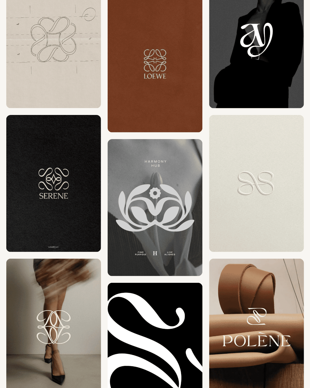
Brands that use submarks beautifully
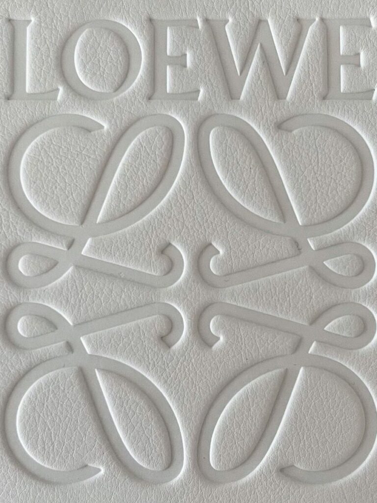
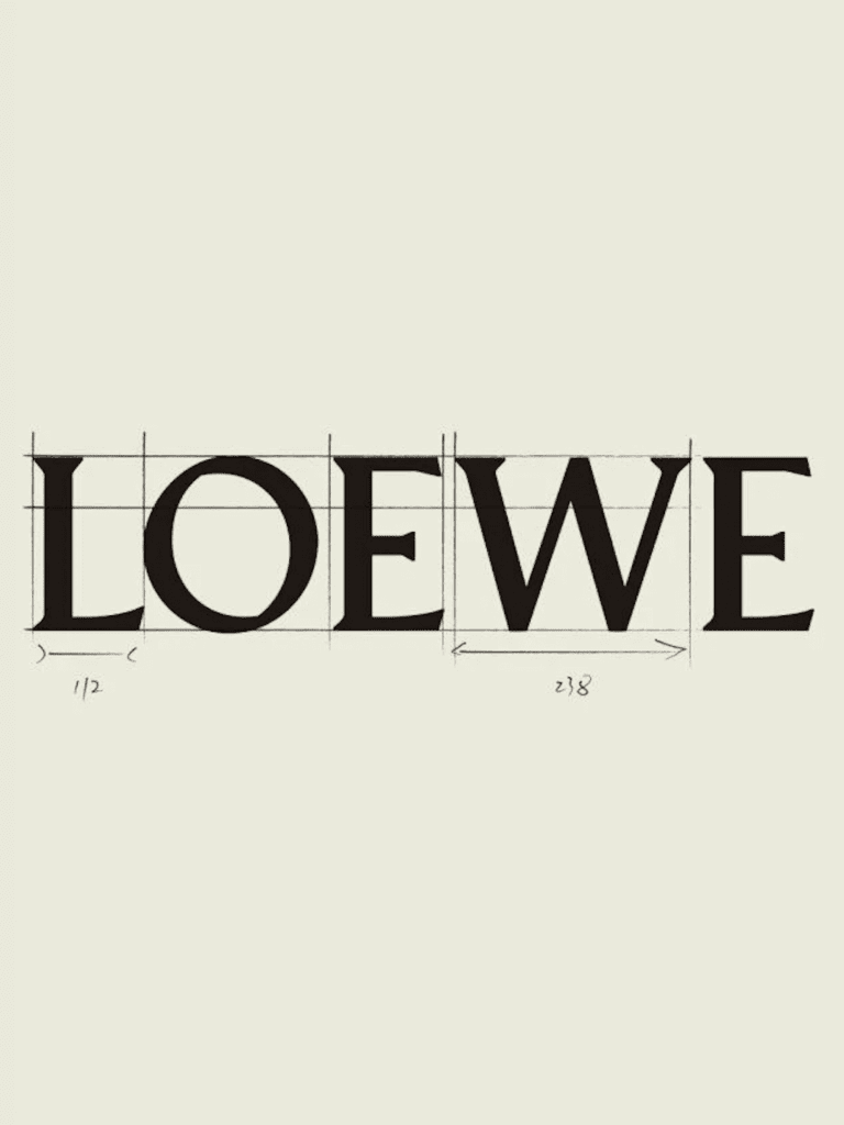
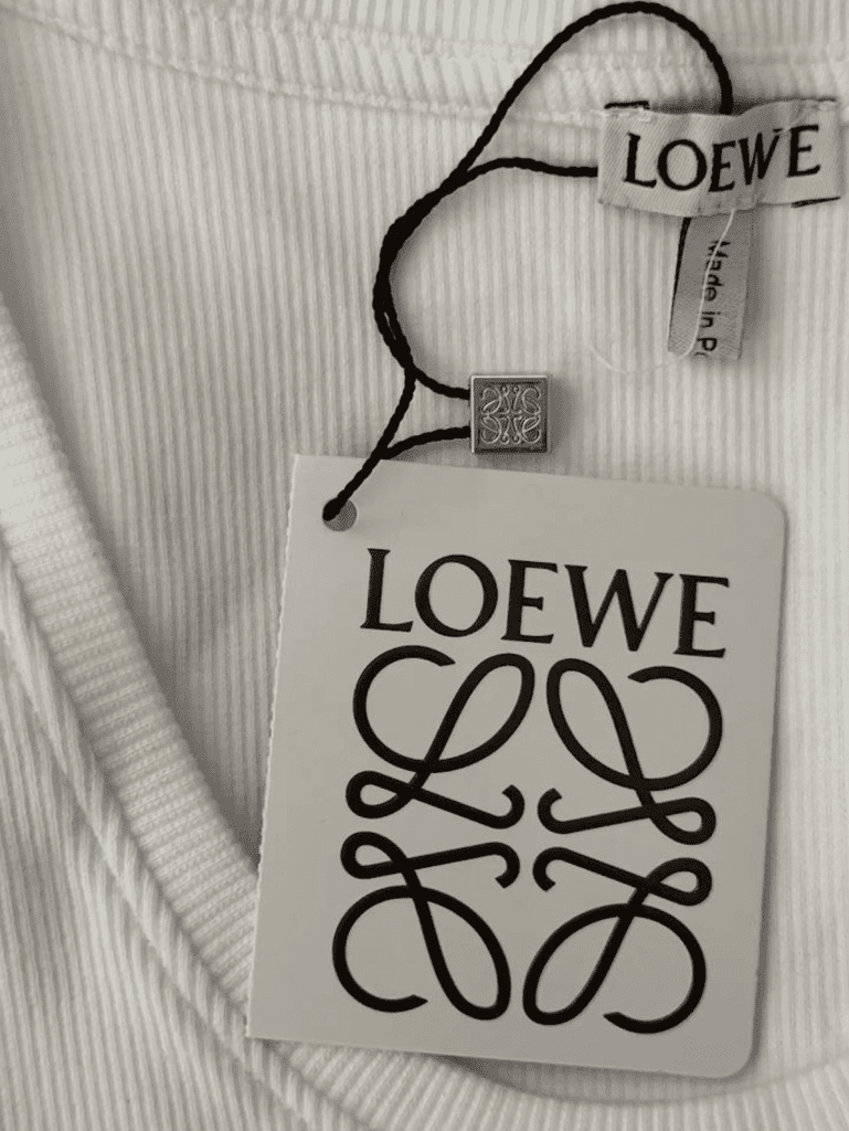
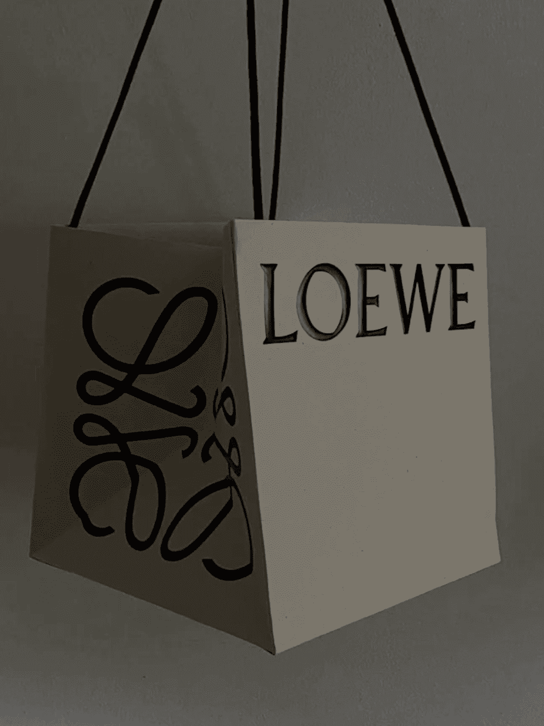
Loewe
Loewe’s anagram is the kind of detail you don’t forget. It’s intricate, almost ornamental, and it shows up everywhere. Embossed into leather, stamped onto packaging, woven into the brand’s world.
The wordmark introduces the brand. The submark deepens it. Over time, that symbol becomes just as recognisable, if not more.
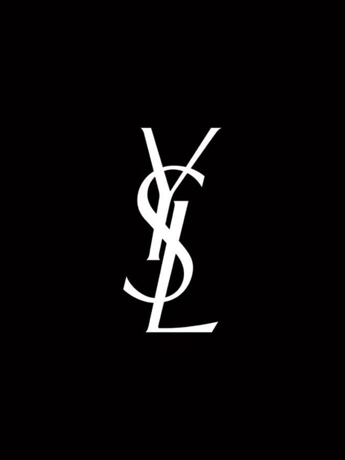
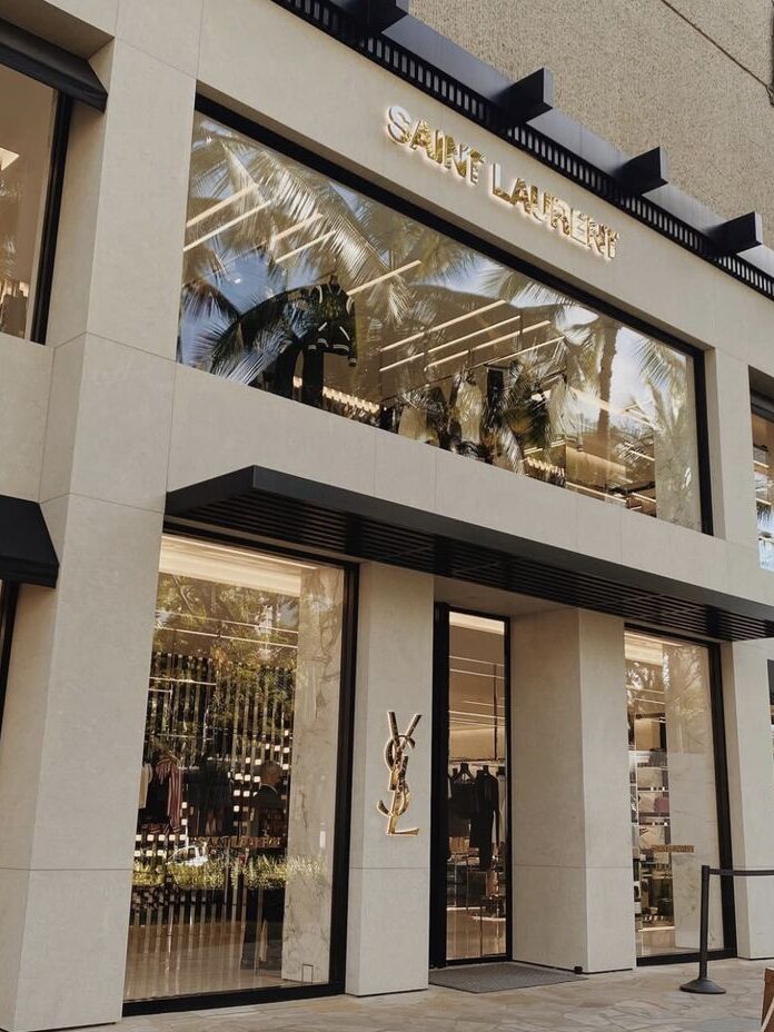
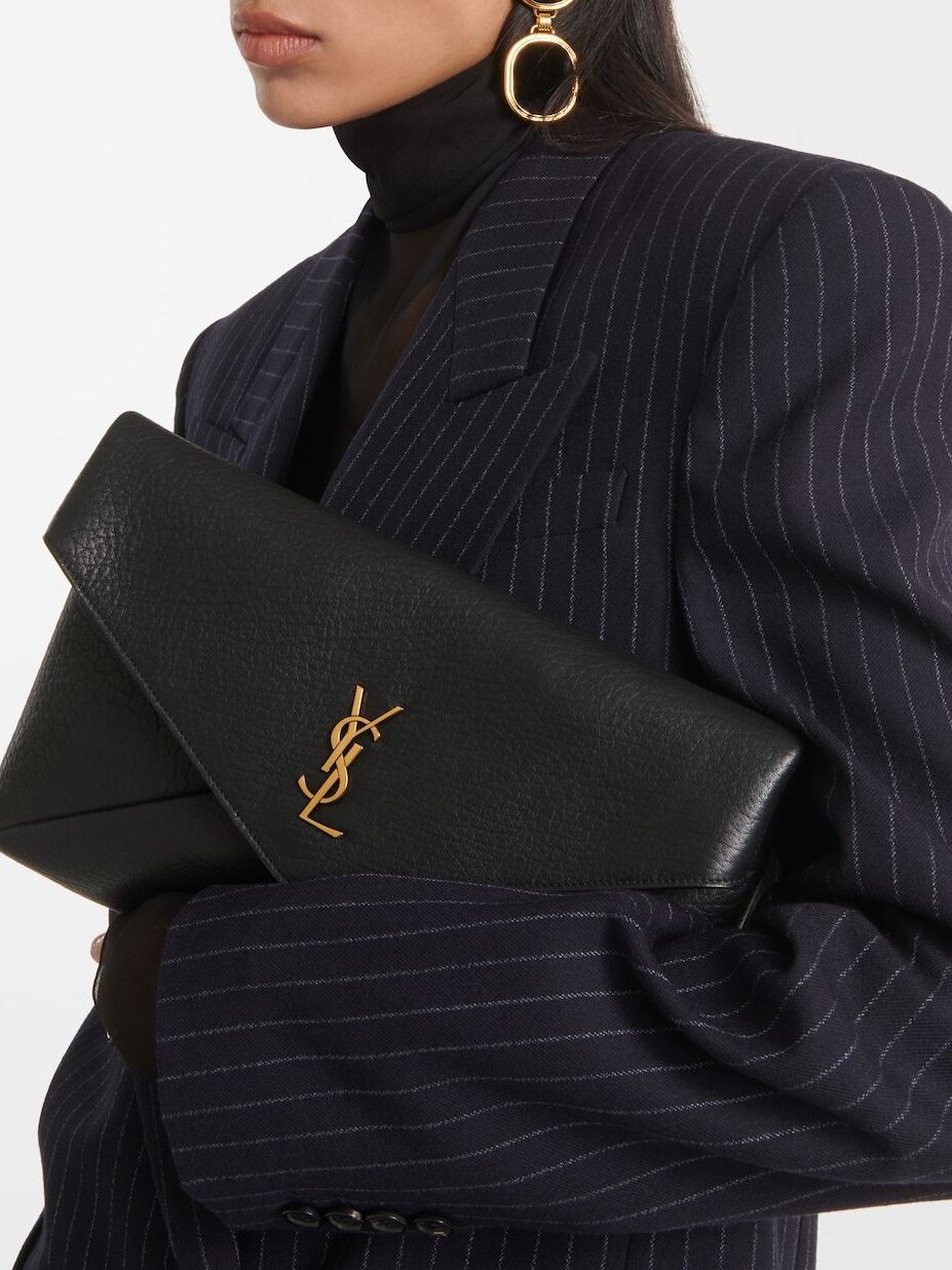
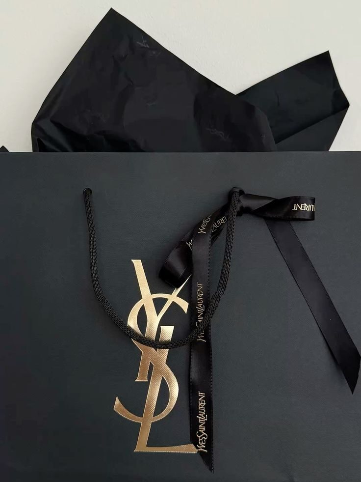
Yves Saint Laurent
If Loewe is intricate and ornamental, Yves Saint Laurent is pure attitude.
The YSL monogram is one of the most recognisable submarks in fashion. Not loud. Not complicated. Just… certain.
Three letters, stacked with intention. Slim, elongated, slightly rebellious.
And here’s what makes it so powerful. It doesn’t feel like a secondary option. It is the brand.
Where most brands get this wrong
They treat branding like a checkbox. Logo? Done. Colour palette? Done. Typefaces? Done.
But then the brand has to actually live. And suddenly, it feels like something’s missing.
Because it is. A brand without variations relies too heavily on one asset to do everything.
And that’s where things start to feel:
- Repetitive
- Awkward
- Inconsistent
Not because the design is bad. Because it’s incomplete.
If you’re sitting with one logo right now
This isn’t a teardown. It’s a turning point. Look at where your brand exists today.
Where does your logo feel:
- Too big
- Too small
- Too heavy
- Too absent
That’s your cue. That’s where a submark belongs. Because the goal isn’t to create more for the sake of it.
It’s to build a brand that moves with ease. That adapts. That feels just as considered on a lip balm cap as it does on your homepage.
When that happens, everything clicks. Your brand stops feeling like a single moment…
And starts feeling like a fully realised presence.
From logo… To brand suite.
From “this looks ok”… To “this feels right, everywhere.”

")