
Your product page shouldn’t feel like a maybe. It should feel like a yes that’s already been decided. And if it doesn’t? It’s rarely because your product isn’t good enough. It’s because your page isn’t doing its job.
I say this as someone who has built ecommerce brands myself, and now works closely with founders doing $500K to multi-million on Shopify. The difference is never just aesthetic.
It’s clarity. Structure. Intent. So instead of circling the problem, let’s get into what actually fixes it.
Start here – the 5-second product page test
Open your product page. Now ask yourself, honestly: “Within 5 seconds, can a new customer answer What is this? Who is it for? Why is it better or different? How do I buy it?”
If not, nothing else on your page matters yet. This is your baseline.
1. fix your above-the-fold (this is where most pages lose the sale)
What most founders do:
Hero image, product name, price. Maybe a vague one-liner. A essay as a description (ie. too long, too boring).
What you actually need:
Left side (or top on mobile):
- Clear product title (not overly creative)
- Price
- Variant selector (if applicable)
- Add to cart button (visible immediately)
Right side (or directly under title):
- A one-sentence benefit-led hook
- 3–4 bullet points that remove doubt
Example structure:
Hydrating Barrier Repair Cream
$68
“Deep hydration that actually lasts through the day”
- Supports compromised skin barriers
- No fragrance, no irritation
- Works under makeup
- Results in 7 days
Why this works:
You’ve answered what it is, who it’s for, and why it matters before they scroll. No guessing. No effort.
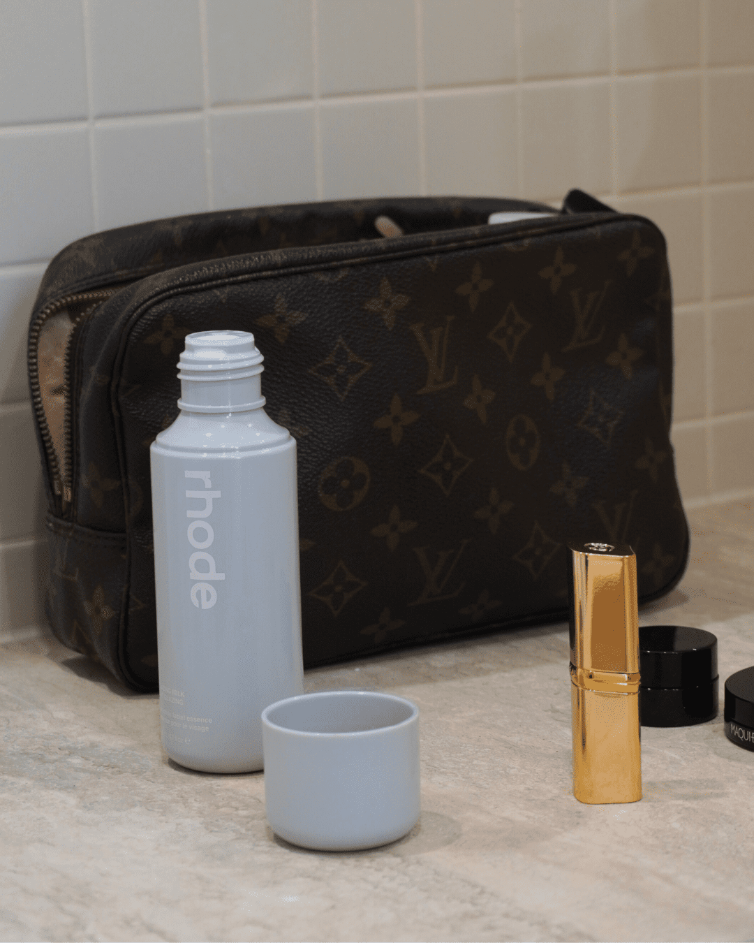
2. use imagery like a sales tool (not just branding)
You don’t need more images. You need more useful images.
Here’s the exact image stack I recommend:
- Hero product shot
Clean, simple, easy to understand - Texture shot
Close-up of consistency (cream, gel, oil) - On-skin result
Show finish, glow, absorption - Application shot
How it’s used (dropper, pump, amount) - Lifestyle/context
Bathroom shelf, routine placement - Before/after or result (if relevant)
If you’re missing 2–3 of these, your customer is filling gaps in her head. And when people have to imagine, they hesitate.
3. rewrite your product description into sections (not paragraphs)
No one is reading your full description top to bottom. So stop writing it that way.
Use this exact structure:
what this is
One or two sentences. Clear. No fluff.
why it’s different
Call out the key differentiator. Ingredient, formulation, result.
who it’s for
Be specific:
- Skin type
- Concerns
- Even who it’s not for
how to use it
Simple, step-by-step. Remove uncertainty.
key ingredients or features
Only what matters. Not the entire lab report.
4. bring your reviews higher (and make them do more)
Most brands bury reviews at the bottom. By then, your customer has already decided to leave.
Instead:
- Add a review snapshot under your CTA
Example: ★★★★★ 1,248 reviews - Pull in 2–3 standout reviews near the top
Focus on transformation, not praise
Bad review: “Love this!!”
Good review: “Cleared my hormonal breakouts in 2 weeks”
Use UGC that looks real
Slightly imperfect > overly polished
Social proof 9reviews, UGC videos, dynamic social feeds are no longer ‘nice to haves’ and instead and baseline requirements for any Shopify store.
5. add a “why trust us” strip (this is underrated)
Right under your add to cart section, include a simple trust row:
- Dermatologist tested
- Made in Australia
- Free shipping over $X
- 30-day returns
This works because it answers objections before they fully form. It’s subtle. But it reduces hesitation instantly.
6. answer objections before they leave the page
Add a short FAQ section directly on the product page. Not generic ones. Real ones.
Think:
- Will this clog pores?
- Is it safe for sensitive skin?
- Can I use this with actives?
- How long until I see results?
If your customer has to leave your product page to Google these, you’ve already lost control of the sale.
7. fix your add to cart experience
This is where small UX decisions make a big difference.
You want:
- Sticky add to cart on mobile
- Clear variant selection (no confusion)
- Immediate feedback when added to cart
- Upsell that makes sense (not random)
Example upsell:
“Pair with: Gentle Cleanser (most customers use these together)” – Not five unrelated products thrown in.
8. simplify your page before you add anything new
Before you add more sections, do this:
Remove:
- Repetitive messaging
- Overly branded headings that say nothing
- Icons that don’t add clarity
If everything is important, nothing is.
The standard your page should hit
A strong product page doesn’t feel like work.
It feels like:
“I get this”
“This makes sense for me”
“I trust this brand”
“I’m comfortable buying”
That’s it. Not overwhelmed. Not convinced. Just… decided.
Final thoughts
A lot of beauty brands look good now. That’s the baseline. What separates the ones that scale is how clearly they sell. So if your product page isn’t converting the way it should, don’t just redesign it. Rebuild how it communicates. Because when this page is doing its job properly, everything else you’re doing starts working harder.

")